MAPPING
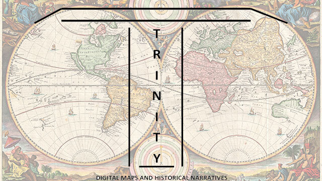
Using maps to tell a story is a perhaps the most basic and in some ways compelling example of data visualization. This idea shaped the development of the Trinity project back in 2013. I designed this critical making project for students in my urban research class to create maps based on primary sources collected for the final research paper. I intended this to act as digital companion project to the final written paper. I replaced a rough draft with this mapping project with the intention that the digital narrative would act as a parallel structure based on the primary source. Completing the map required information fluency, critical thinking, knowledge integration, and spatial awareness as they organized the primary sources. I continue to refine the idea of mapping as a tool for historical engagement. You can see the good, bad, and the all too ugly result on this page. It is a learning process for me, but these efforts inform a stronger classroom experience.
Historic Harlem
I developed this walking tour of Harlem for a summer immersion trip. The goal was to allow workshop participants to explore Harlem on their own. This map provides a walking tour that is focused on the historic African-American narrative linked to the neighborhood.
THE FIRST QUESTION
Following the making in public logic articulated by several digital humanist I know, I'm including this map project.The First Question was inspired by 50th anniversary of Doctor Who conference I attended. As a U.S. citizen who grew up watching Doctor Who I'm curious about U.S. reception of the character. The goal of TFQ was to explore this reception question. Doctor Who is described as a flagship drama by the British Broadcasting Company (BBC) and it is distributed worldwide. Within the increasingly globalized media environment, the BBC has claimed its represent British values and has described itself as "an agent of soft power in the world." This project sought to engage fans around the their experience of viewing Doctor Who through an online survey. While the structure of the survey has proven problematic (a survey design failure on my part) mapping results from base demographic and location data was an easier exercise. The map depicts the respondent nationality and the country they were in when they viewed Doctor Who.
